Compendium
Motion Graphics, Publication, & Creative Writing
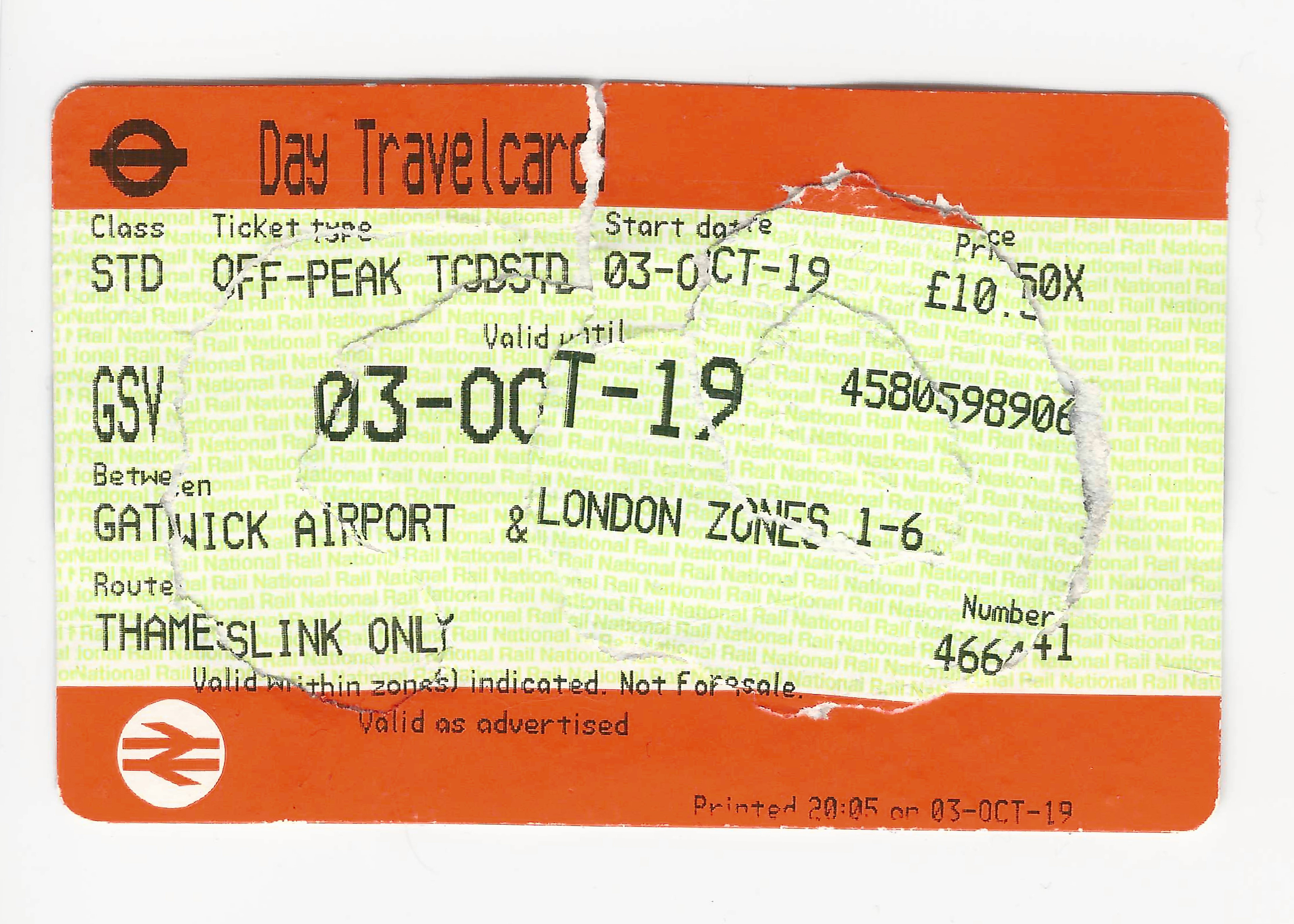
Compendium focuses on the investigation of ‘tickets’ as a means of exploration of narratives and shared experiences. It explores the interdependency of design and the public in the focused micro-environment of the Transport for London (TfL) system.
Shown in Confluence 2019 in London, UK.
Pataphysical Slide Rule
Product Design & Digital Illustration
As a part of the Goldsmiths Pataphysical studio in winter 2019, I was able to design and send work to be a part of the Gwangju Design Biennale 2019 in South Korea.
Pataphysics is a branch of philosophy often used in design, it is the examination of the imaginary beyond metaphysics. The Pataphysical Slide Rule is a set of tools meant to help identify the ideal dietary items for the ideal self. When used daily, this tool will solve body image issues, health concerns, and mental wellness.
Bad News Haikus
Process Design & Creative Writing
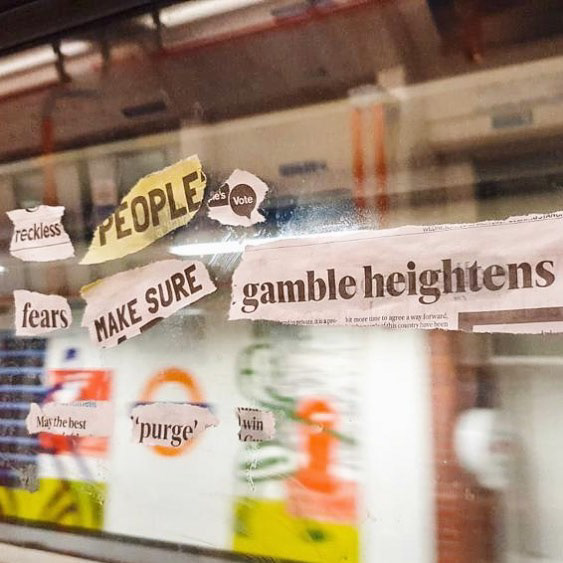
Bad News Haikus are written during a TFL journey (on a bus, train, etc.) with the torn out headlines of the various news publications left behind. This project was developed out of a brief which prompted exploration of interludes. What followed was hands on research within London's expansive network of public transport leading to the #BadNewsHaikus.
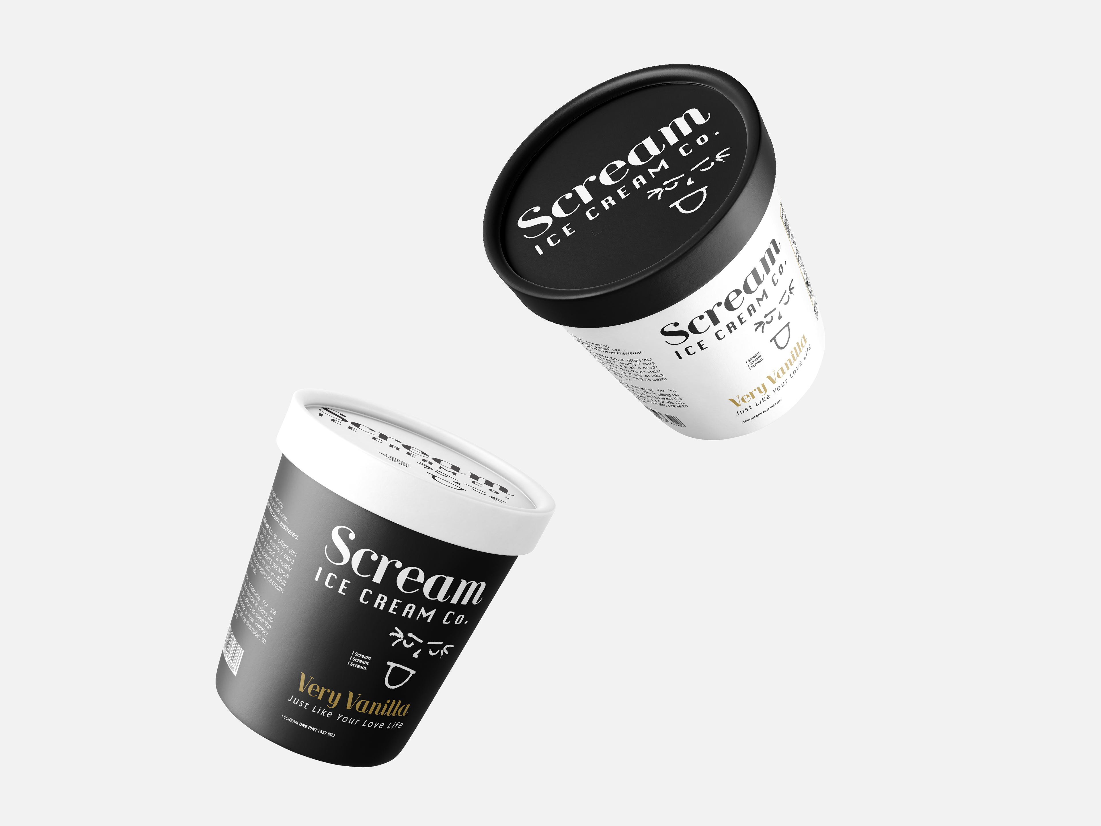
Scream Ice Cream Co.
Packaging Design
This proof of concept project involved choosing a product to design a brand around along with two similar packaging iterations using humour or wit. The aim is to make a product that would blend seamlessly on a grocery store shelf fooling shoppers at first glance, but deliver a cheeky pun or punchline on further inspection.
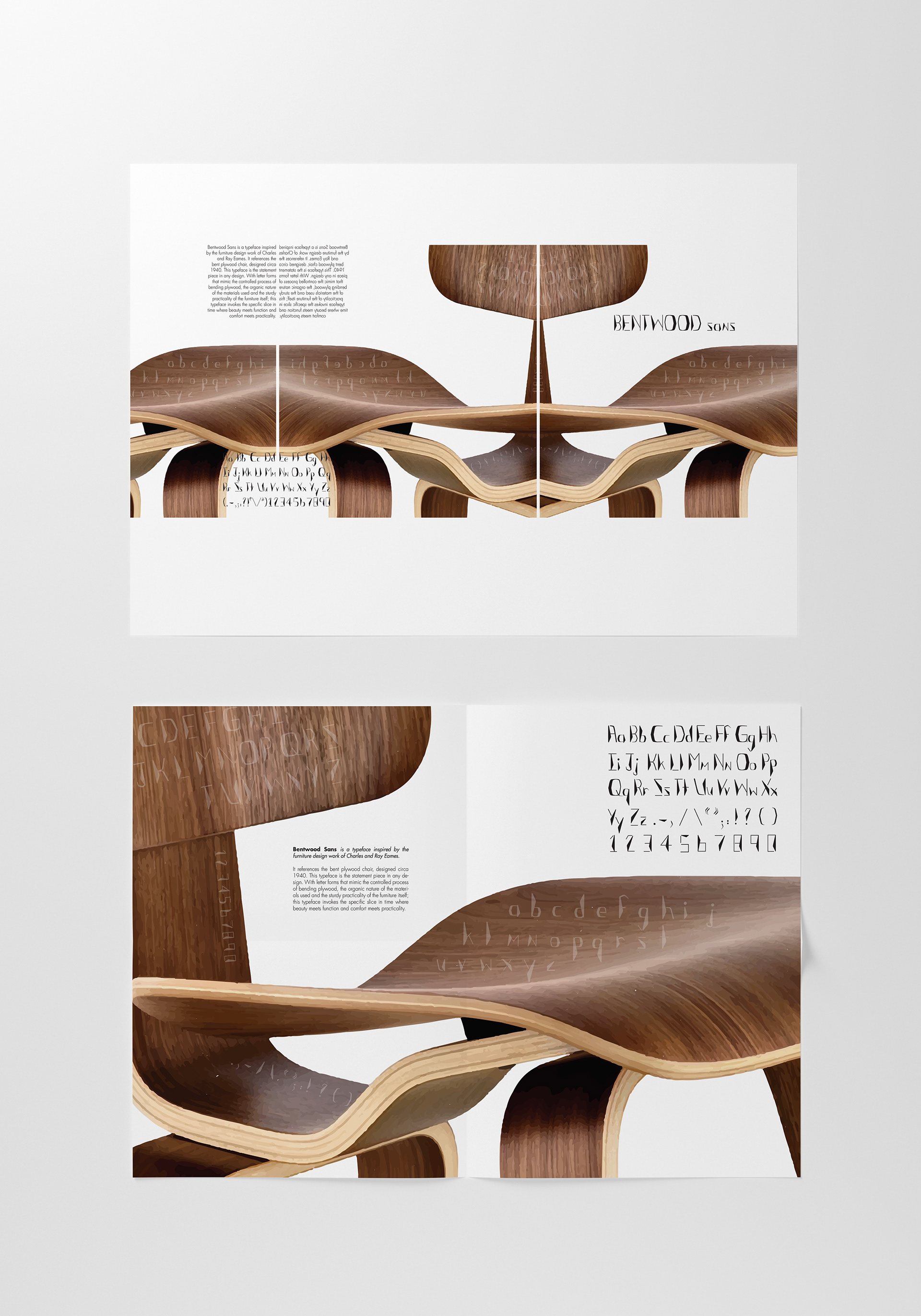
Bentwood Sans
Typeface Design
Bentwood Sans is a Display Typeface, inspired by the iconic design: Charles and Ray Eames Bent Plywood Chair. I crafted each letterform by hand, then recreated them all digitally in Adobe Illustrator, and put the typeface together using FontLab Studio 5. Pictured here are two poster designs showcasing the typeface.
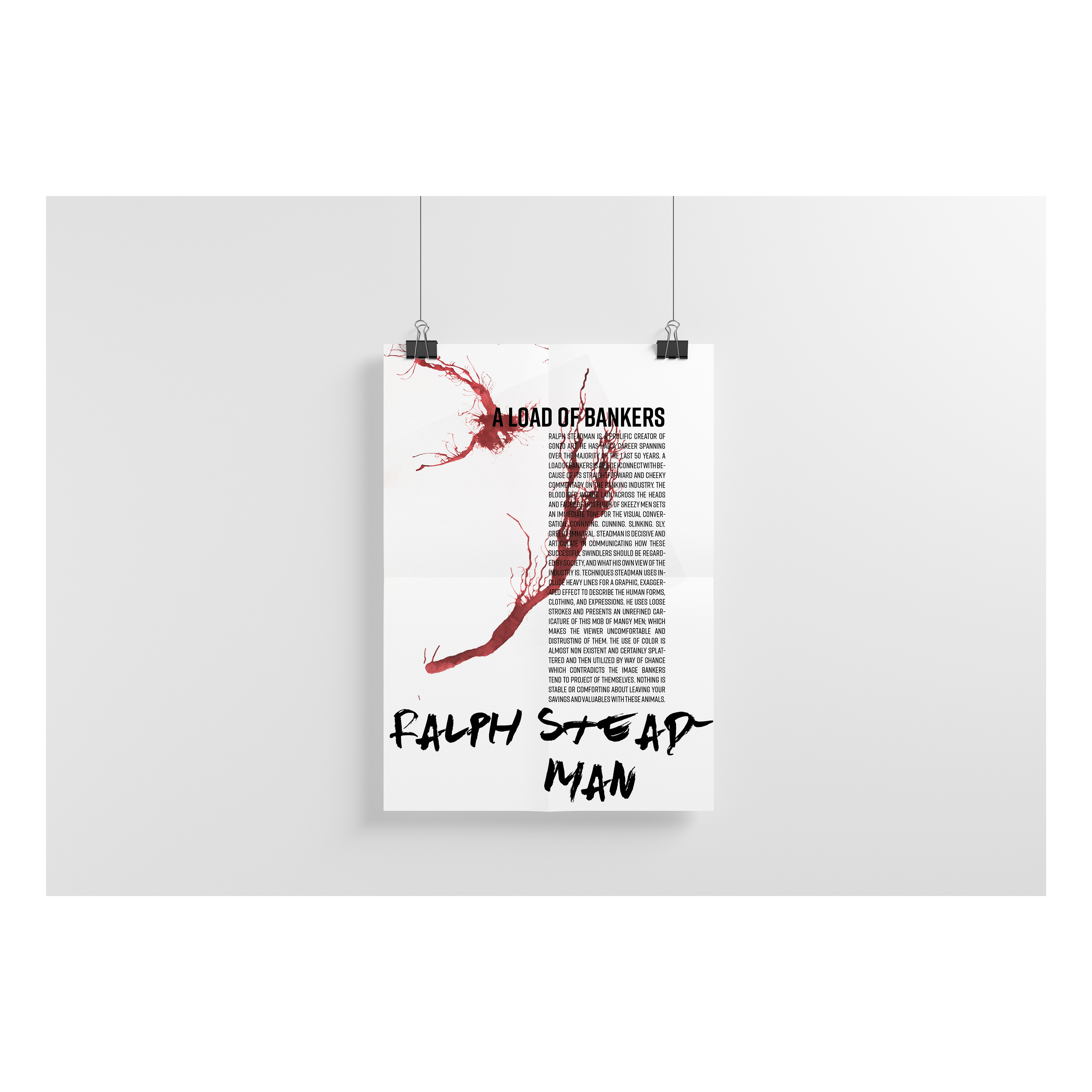
Kindred Artist
Poster Design & Editorial
This process piece involved the choice of a kindred artist's work, an analysis write up, and then an attempt to recreate the artists creative process, using iterations of this exploration in a series of original print design work.
Chosen work was A Load Of Bankers By: Ralph Steadman. Media used included Ink on paper, Editorial Design, and Digital Illustration.
Bumble Bee
Digital Illustration
This is a digital illustration realised by a combination of hand sketching and Adobe Illustrator. Other illustration tools I often use are iPad Pro + Apple Pencil, Adobe Fresco, Adobe Photoshop, and hand drawn on paper.

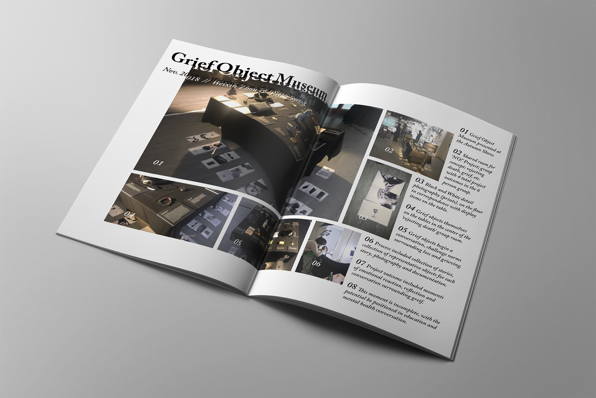
Grief Object Museum
Curation & Publication Design
Brief included the statement "NO!NO!NO!" and asked for a rejection of something. The Grief Object Museum rejects societal norms surrounding the grieving process. It challenges the viewer to reflect on objects they associate with grief & healing and asks them to evaluate their personal relationship with grief.
Project partner: Weixin Zhou